
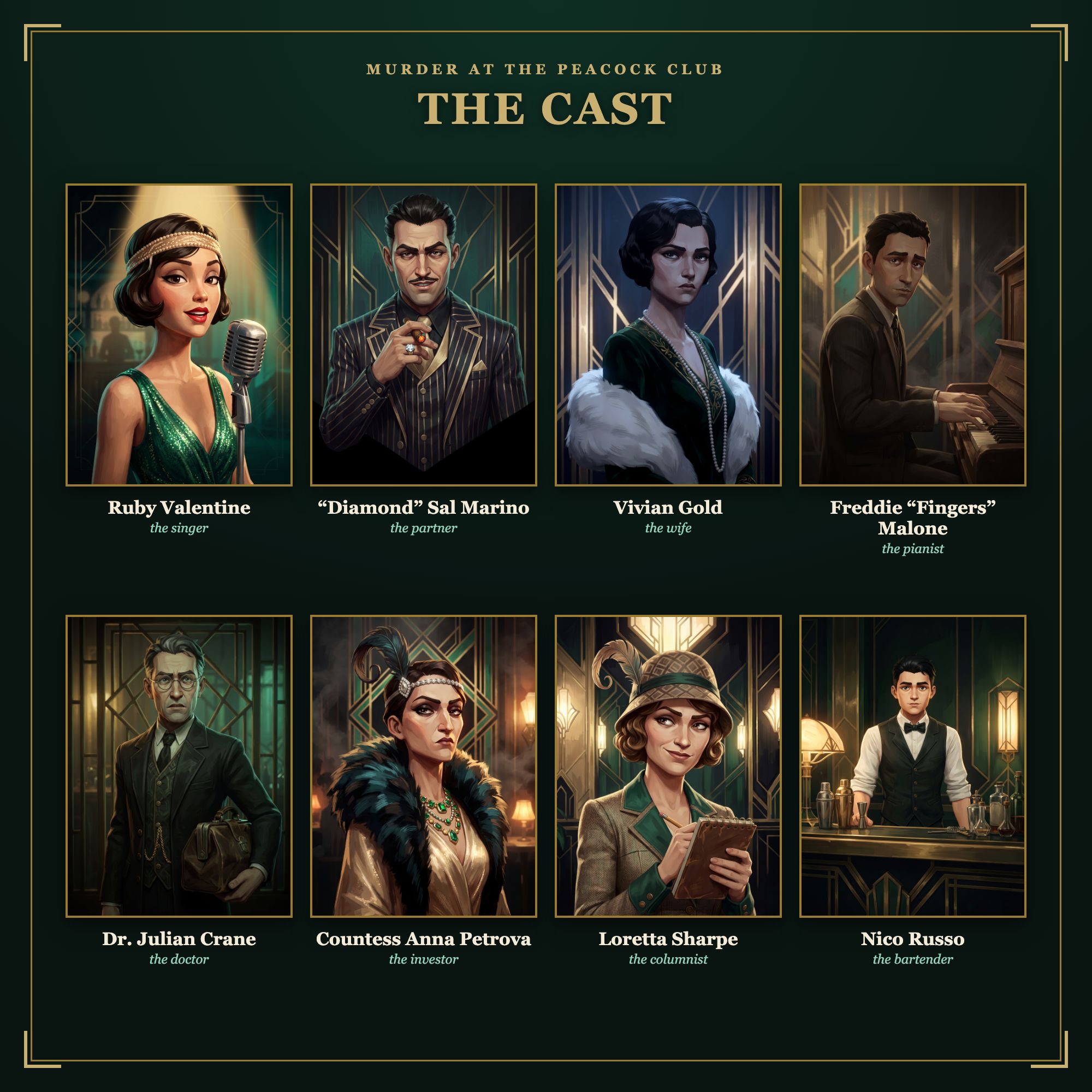
Before a single clue was written for Murder at the Peacock Club, the game had a palette: champagne gold for the highlights and the deco lines, deep peacock emerald for the club's signature, ink black for everything behind them, and warm amber light with small hits of teal. Every portrait, card and cover in the kit follows it, which is why a table covered in printouts still reads as one production.
The look: painted cinema, not costume-shop clip art
The reference point for the portraits was the look of a modern animated feature — dimensional, sculptural characters finished with hand-painted texture and visible brushwork, lit like a film still rather than a photograph. Low-key, moody, chiaroscuro lighting; smoke, gold and velvet; a little dangerous. The aim was that each character card should feel like a poster for its own film.
That meant strict rules. Stylised, expressive anatomy with sharp, readable silhouettes — because at a candle-lit dinner table, a portrait has to read from an arm's length away. A dark background with subtle deco geometry, so the faces carry the light. And one consistent treatment across all nine portraits, so the cast reads as a set and no character looks more important than another. In a whodunit, that last rule is load-bearing: the art must never tip the table off.
Nine faces, one club
The eight suspects each got a portrait that says who they are before a word is read : the singer, the partner, the wife, the pianist, the doctor, the investor, and the two who join at larger tables . The brief for each was the same: shoulders up, close to camera, rich colour inside the palette, and a silhouette you could identify in the dark.
The ninth portrait is Inspector Hart — the detective who arrives on screen with new evidence while everyone else is busy lying. He's drawn in exactly the same treatment as the suspects, because he lives in the same world, but nobody at the table plays him. He's also the one character who will outlive the Peacock Club: the Inspector works every case in our catalogue.
Why the deco stays inside the game
Everything 1925 about the art — the geometric peacock-feather motifs, the gold-on-emerald poster language, the display type — belongs to the Peacock Club and stays inside its kit. Our next case is set somewhere entirely different, and its art will follow its own world with the same discipline. The thing that carries across isn't a style; it's the standard — painted, cinematic, consistent, and never letting a portrait spoil a mystery.
Some of the artwork in our kits was produced with the help of AI tools, then directed, edited and assembled by hand — and the story, characters and every word of the script are entirely original. The palette, the casting and the rules above are where the craft lives: the tools change, the art direction doesn't.